Removing Chart Gridlines and Plot Area Background in Report Studio
The steps from IBM’s official documentation, while they attempt to lead you in the direction of changing these properties of a chart, did not register with my brain for about an hour or so of clicking around, frustrated that I could not find the properties they were describing in the articl. Just in case I could spare anyone else the frustration of trying to remove gridlines in Report Studio’s current default charts, I thought I’d post this quick article on how I solved my problem.
The documentation states, “Step 1. Select the Y-axis or the X-axis of the chart”.
Easy enough, right? Well as it turns out, Step 1 is where I was going wrong…
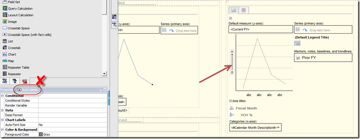
Where was I clicking? Not the Y-axis apparently. I was clicking the label for the Y-axis:
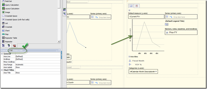
Once I was clicking the right thing, the solution to remove the grid lines from my chart was simple. So where did I need to click?
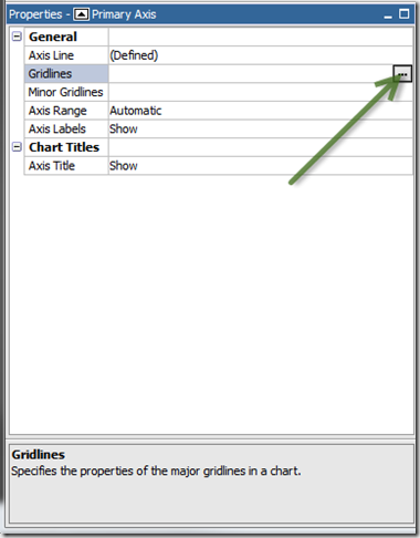
The correct properties show up in the property inspector once you’re actually clicking the axis and not the axis label. To remove the grid lines and the alternating colors in the plot area, simply redefine the Gridlines property:
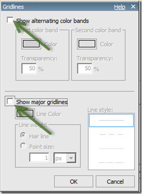
Clear the checkboxes for “Show alternating color bands” and “Show major gridlines” to get rid of them on the chart:
comments powered by Disqus


